
Tiempo de lectura: 2 minutos

29.01.2017
Galeria Nara Roesler, São Paulo, Brazil
21 de noviembre de 2016 – 21 de enero de 2017
The group exhibition Chromophilia vs. Chromophobia: an exploration of color features eighteen pieces by Abraham Palatnik, Antonio Dias, Bruno Dunley, Cao Guimarães, Carlito Carvalhosa, Daniel Buren, Daniel Senise, Haegue Yang, Hélio Oiticica, Julio Le Parc, Karin Lambrecht, Lucia Koch, Marco Maggi, Rodolpho Parigi, Sérgio Sister, Tomie Ohtake, Vik Muniz, and Xavier Veilhan. Organized by the gallery’s artistic director Alexandra Garcia Waldman, it centers on the battle between the color chart vs. the color circle.
Building on the theoretical base of the essay Chromophilia from David Batchelor’s book Chromophobia, the exhibition experiments with how contemporary artists play, destroy, and reveal in the tension between post-1960’s use of industrial colors and the advent of the color chart. Batchelor describes the color chart as a disposable list of readymade color. “Each strip of paper is a perfect abstract painting in miniature, or a compact example of color serialism or one page of a vast catalogue raisonné of monochromes.” The chart gave artists freedom and autonomy in their use of color, previously unimaginable within the rigid structure established by the color circle. As he states: “the color circle establishes relationships between colors and implies an almost Feudal hierarchy among colors –primaries, secondaries and tertiaries, the pure and the less pure.”
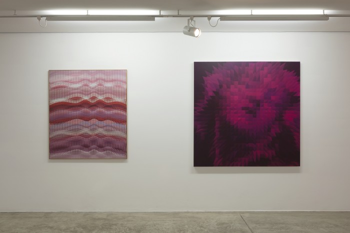
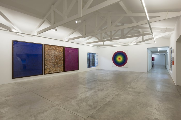
The artists greet viewers with the full spectrum of drama with color. Daniel Buren rejected the idea that eliminating color would produce a purer form of art –quite the opposite: for him, color is essential and cannot be substituted by words or action. Shown alongside Colors, light, projection, shadows, transparency: works in situ 5, by Daniel Buren, is Rodolpho Parigi’s Santa Teresa Nerveux, with explosive colors weaving flat geometric forms into compositions that evoke fragmented, semi-abstract urban landscapes. In the same space, Pictures of Pigment: Monochrome, pink-blue-gold, after Yves Klein, by Vik Muniz, communicates a sentiment of control through the vivid color of choice of the late Yves Klein. On the other side of the exhibition, Sérgio Sister recontextualizes classical ideas about the canvas as a window in his exploration of the intricate relationship between colors when they interact with space and air.
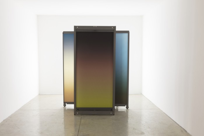
For Tomie Ohtake, color was a lifelong fascination, and she explored them continuously with juxtapositions of circles, ovals, arcs, and mounds to emphasize the experience of her works. The selected piece, one of her more recent paintings, invites contemplation and immersion into the logic of her art. Lucia Koch also utilizes color to preserve, alter, and continue an experience, showcase –gradient, from the gradient series, preserves the color of sunsets onto printed canvas. The work is then lit from the back and the experience is completely altered by an artificially preserved nature.
The artists challenge the viewers to experience color. They materialized colors to provoke freedom of experiment, leaving behind the rigidity of the color circle.
Continuing her exploration of color and this hypothetical battle between the color chart and the color circle, Galeria Nara Roesler’s artistic director Alexandra Garcia Waldman presents the second part of the group exhibition Chromophilia vs. Cromophobia: Continues, now at the Rio venue.
http://www.nararoesler.com.br/
compartir:


23.03.2024
Opinión
Duen Neka’hen Sacchi
En medio de la crisis ética que atravesamos en nuestra región y el mundo entero, expuestos como testigxs del fortalecimiento de la brutalización y la crueldad como elementos que sostienen las democracias fascistas; el curador y artista Duen Neka’hen Sacchi nos comparte su urgente reflexión sobre el contexto argentino.
22.03.2024
Marginalia
La Revuelta
Invitamos a La Revuelta, un espacio, un hogar, un punto de encuentros radicales donde el horizonte de la vida se pone al margen de lo sensible desde el contexto del arte contemporáneo en la ciudad de Guatemala. Cristina, Maya, Fernanda, Jimena, Francis y Vekis comparten con nosotres el marginalia 98.
08.03.2024
Opinión
María Galindo
Aprovecho para pasarte esta bibliografía para el próximo curso sobre feminismo que dictaré en cualquier recinto, esquina, librería, casa autogestionaria o barrio.
29.02.2024
Reportes
Ana Clara Simões Lopes
Con 121 artistas de Colombia, Perú, Venezuela, Ecuador, Bolivia, Guyana, Guayana Francesa, Surinam y Brasil, bajo el título Bubuia: las aguas como fuente de imaginaciones y deseos, se llevó a cabo la primer edición de la Bienal de las Amazonas, misma que contó con la curaduría del colectivo de mujeres Sapukai -que en tupí significa canto, clamor o grito- integrado por Sandra Benites, ex curadora de arte indígena del MASP; Keyna Eleison, curadora y exdirectora artística del Museo de Arte Moderno de Río de Janeiro; Vânia Leal, curadora independiente; y Flavya Mutra, artista e investigadora.


Comentarios
No hay comentarios disponibles.